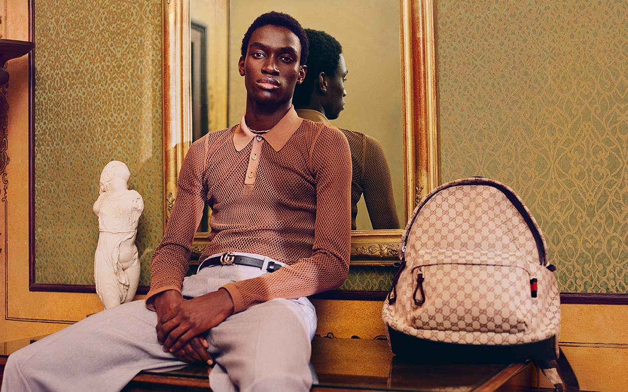
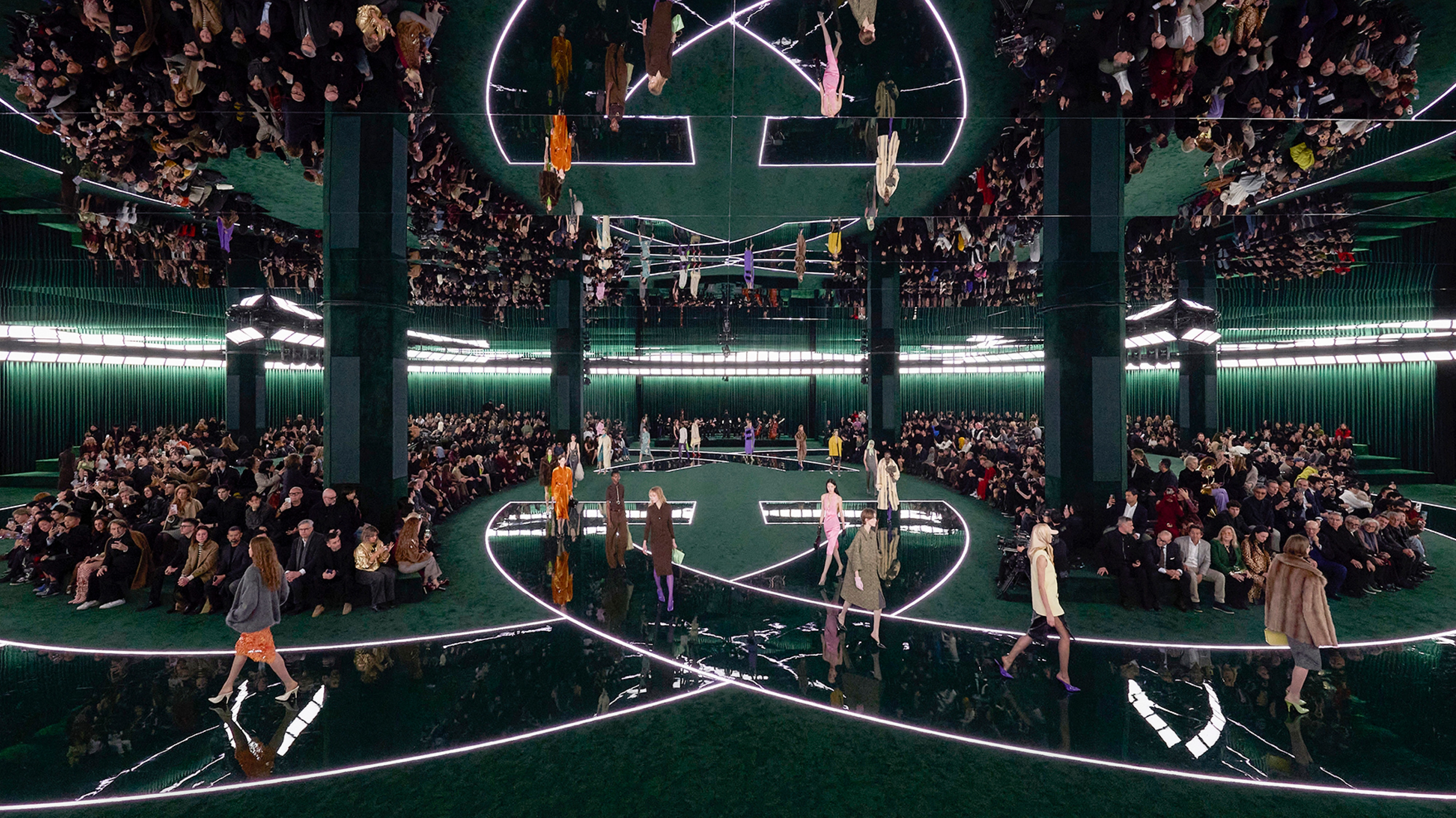
Named after the first natural history encyclopedia published in the 15th century, English photographer Derek Ridgers captures the Pre-Fall 2017 collection in a new book.
In the images, Alessandro Michele’s collection contrasts against the antique surrounds of the Spezieria di Santa Maria della Scala and Biblioteca Angelica in Rome, conveyed in Derek Ridgers’ music and street culture photography style. Here, the photographer gives insight into the inspiration behind ‘Hortus Sanitatis’ (Latin for ‘The Garden of Health’).
What type of tone and aesthetic were you looking to communicate in the images for the book?
The tone and aesthetic were all down to Gucci and Alessandro Michele. My role was really just to record what I saw and to make it clear and uncomplicated. To hold up a window frame through which the viewer can see the world. And to try to keep myself well out of the equation. That’s a kind of aesthetic, I suppose. An engineered absence. It’s one that I’ve tried to embrace over the years. But it’s always totally dependent on the circumstances I find once I'm in situ.
How did the clothes and accessories of the Pre-Fall 2017 collection interact with the locations—what did they add to the photographs?
The thing that linked the locations, besides the history and the culture of Rome, was that each location involved some element of learning or study. Perhaps the idea was that to have knowledge of the past will help one better understand the future? I’m speculating. But the clothes are so colourful and so futuristic that it has to be something like that. Doesn’t it?
What was visually intriguing about the locations?
Intriguing isn’t really the correct word. When I first saw these locations I was horrified. It wasn’t that the locations weren’t beautiful - they most certainly were - but there was such an immense amount of detail in each place that I thought the clothes might be overwhelmed. In the library and the pharmacy, there was a preponderance of brown and gold tones. Ancient, dusty, brown leather books and brown, varnished wood. In the case of the pharmacy, it was more brown wood and brown and gold glass bottles. Sprinkled with a few dark blue bottles with skulls head markings. My fear was such beautiful and historic locations might totally dominate. Of course, that was before I saw the clothes. There wouldn’t have been very much, if anything that could dominate those.
How do the images you shot for this book contrast to your usual style and subject of work?
The work that I’m mainly known for - documentary portraits of the late 70s and early 80s - is entirely about reality and real life situations. People, faces, their personalities and their clothes. Often in that order. I was always trying to find beauty in people who didn’t consider themselves beautiful and vulnerability in people who didn’t consider themselves to be vulnerable. And my ability to gently and quietly relate to my subjects was also vital. In this case, everything was similar but not the same at all. Afterwards, when I looked at the photographs, some of them could almost have been taken in Blitz or Taboo Club in the 80s. Almost but not quite.


Link copied to clipboard.